Web Design
April 6, 2010 at 3:46 am 1 comment
Animation: http://www.minichips.com.co/. This alien-themed site is fun to play around on. Even the animation of the navigation icons and the loading symbol contribute to the fun, kooky theme of the site. Rollover icons and links to Facebook also make minichips a well-designed, user-friendly site.
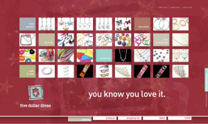
Fashion: http://www.fivedollardivas.com. This feminine site uses Gestalt principles similarity and proximity to make a consistent, easily navigable page. I also like the use of simple typography. I wish the secondary pages had more links to other pages, but overall I’m impressed by the easy navigation on the home page. There are so many elements for the user to explore and click on.
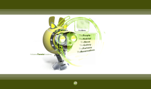
Sports: http://www.hofsaesstennis.com/enflashlow/ensite.html. This site uses one major element – the tennis ball – with different animations to create a consistent, harmonious design. The color scheme is simple and appropriate; green and yellow are the dominant colors in a game of tennis. White space is also used effectively to frame the animation. The green bars on the top and bottom of the page anchor the graphic.
Travel: http://www.thecanyons.com/springgruv/sg.html. This site was cool and engaging. It’s targeted toward a young adult or teenage crowd. The warm colors contrasted with the black make the site bold and eye-catching. All text on the secondary pages is short and headline-style; there’s nothing for the user to get lost or bored in. The site was designed with quick-scanning users in mind.
Typography: http://delamberg.net/. This site is basic. It rests on a foundation of typography with content in an outline style. It still feels modern and artistic, however. Most users are familiar with an outline and can easily navigate the site. I also like the cool colors with the large sans serif font.
Education: http://www.B7Ven.com/. I like the cool graphics, frame of white space and digitized styleof this site. It loads quickly and is easy to navigate with simple buttons. I also thought the portfolio page was a nice presentation of portfolio items: simple and beautiful.
Corporate: http://mars.fortis-watches.com/. This site is bold and sleek and makes great use of contrast in its design. Its navigation is simple: move left, move right. The clicking dial feature and large watch images are a nice touch.
Logo: I like the simple, bold design of this logo. The Gestalt principle of continuation is utilized in the M, and the sans serif font contrasts the script in the logo.
Kids: http://www.idbox-monaco.com/. I think this site is awesome. It has beautiful graphics, fun sounds, nice animation and great color choices. The secondary pages are just as cool and link to all other pages for easy navigation.
My choice: http://www.richardwarddesign.com. The colors attracted my eye to this site, and the typographic logo works well with the soft pastel color scheme. The site is easy to navigate as its page icons always stay in the same place as the user clicks through the site. The designer also used white space to nicely frame the pages and focus on the colors.
Entry filed under: Uncategorized.
1 Comment Add your own
Leave a reply to jennpal Cancel reply
Trackback this post | Subscribe to the comments via RSS Feed


1. jennpal | April 11, 2010 at 4:15 pm
Great examples, but you didn’t embed the links. Thanks for providing them, but they should have actually been links.